

PatioHQ – PDP Page Redesign Case Study
PatioHQ – PDP Page Redesign Case Study
PatioHQ – PDP Page Redesign Case Study
01 — Project Overview
The goal of this project was to redesign the PatioHQ Product Detail Page (PDP) to improve product clarity, simplify customization, and increase conversions. The existing PDP had structural issues such as inconsistent spacing, lack of visual hierarchy, unclear measurement selection, and weak CTA visibility. Through UX auditing and competitor benchmarking, I developed a modern, clean, and user-friendly PDP for both mobile and desktop.
01 — Project Overview
The goal of this project was to redesign the PatioHQ Product Detail Page (PDP) to improve product clarity, simplify customization, and increase conversions. The existing PDP had structural issues such as inconsistent spacing, lack of visual hierarchy, unclear measurement selection, and weak CTA visibility. Through UX auditing and competitor benchmarking, I developed a modern, clean, and user-friendly PDP for both mobile and desktop.
01 — Project Overview
The goal of this project was to redesign the PatioHQ Product Detail Page (PDP) to improve product clarity, simplify customization, and increase conversions. The existing PDP had structural issues such as inconsistent spacing, lack of visual hierarchy, unclear measurement selection, and weak CTA visibility. Through UX auditing and competitor benchmarking, I developed a modern, clean, and user-friendly PDP for both mobile and desktop.
02 — My Role & responsiblity
02 — My Role & responsiblity
02 — My Role & responsiblity
I was responsible for evaluating the current product experience, identifying usability issues, benchmarking leading brands, creating design directions, and delivering the final high-fidelity redesign.
I was responsible for evaluating the current product experience, identifying usability issues, benchmarking leading brands, creating design directions, and delivering the final high-fidelity redesign.
Conducted detailed UX Audit of existing PDP
Identified usability gaps, spacing inconsistencies, and visual hierarchy issues
Performed competitor analysis across 12+ global furniture brands
Created redesign strategy based on insights
Designed mobile and desktop PDP layouts
Organized entire customization flow (measurements, materials, styles, features)
Enhanced CTA visibility and trust components
Delivered clean UI with consistent grid, spacing, and color system
Collaborated with team for feedback iterations
03 — Timeline Overview
03 — Timeline Overview
03 — Timeline Overview
Total Duration: 2-3 Weeks
Week 1: UX Audit + Documentation
Week 1–2: Competitor research & benchmarking
Week 2: Wireframes (Mobile + Desktop)
Week 3: Final UI Design
Week 3: Review, iteration & delivery
Total Duration: 2-3 Weeks
Week 1: UX Audit + Documentation
Week 1–2: Competitor research & benchmarking
Week 2: Wireframes (Mobile + Desktop)
Week 3: Final UI Design
Week 3: Review, iteration & delivery
04 — Design Process
04 — Design Process
04 — Design Process
1. UX Audit
Typography not structured
Inconsistent 8px spacing
CTAs not visible
Product images lacked clarity
Sections not aligned
Review & delivery info placed too low
1. UX Audit
Typography not structured
Inconsistent 8px spacing
CTAs not visible
Product images lacked clarity
Sections not aligned
Review & delivery info placed too low
2. Research & Competitor Analysis
Benchmarked brands like:
Frontgate, Polywood, Sabai, Urban Ladder, Manutti, Pepperfry, etc.
Key learnings:
Large hero image
Guided customization
Trust badges
Clear pricing
Sticky Add to Cart
Reviews above the fold
2. Research & Competitor Analysis
Benchmarked brands like:
Frontgate, Polywood, Sabai, Urban Ladder, Manutti, Pepperfry, etc.
Key learnings:
Large hero image
Guided customization
Trust badges
Clear pricing
Sticky Add to Cart
Reviews above the fold
2. Research & Competitor Analysis
Benchmarked brands like:
Frontgate, Polywood, Sabai, Urban Ladder, Manutti, Pepperfry, etc.
Key learnings:
Large hero image
Guided customization
Trust badges
Clear pricing
Sticky Add to Cart
Reviews above the fold
3. Information Architecture
Re-grouped sections logically
Created modular card-based structure
Introduced unified color, typography, spacing system
3. Information Architecture
Re-grouped sections logically
Created modular card-based structure
Introduced unified color, typography, spacing system
4. Wireframes
Re-grouped sections logically
Organized mobile scroll
Clean layout for customization flow
Clear labels + cards + grids layouts
4. Wireframes
Re-grouped sections logically
Organized mobile scroll
Clean layout for customization flow
Clear labels + cards + grids layouts
5. Final UI Design
Strong hierarchy
Consistent spacing (8px grid)
Modern color palette
Sticky CTA
Cleanest mobile flow with minimal clutter
5. Final UI Design
Strong hierarchy
Consistent spacing (8px grid)
Modern color palette
Sticky CTA
Cleanest mobile flow with minimal clutter
Conducted detailed UX Audit of existing PDP
Identified usability gaps, spacing inconsistencies, and visual hierarchy issues
Performed competitor analysis across 12+ global furniture brands
Created redesign strategy based on insights
Designed mobile and desktop PDP layouts
Organized entire customization flow (measurements, materials, styles, features)
Enhanced CTA visibility and trust components
Delivered clean UI with consistent grid, spacing, and color system
Collaborated with team for feedback iterations
05 — Challenges & Solutions
05 — Challenges & Solutions
05 — Challenges & Solutions
Challenge 1: Cluttered Information Flow
Solution: Structured content into logical modules (Measurements → Material → Back Style → Features).
Challenge 1: Cluttered Information Flow
Solution: Structured content into logical modules (Measurements → Material → Back Style → Features).
Challenge 2: Product images were too small
Solution: Introduced large hero image + zoom + clear thumbnails.
Challenge 2: Product images were too small
Solution: Introduced large hero image + zoom + clear thumbnails.
Challenge 3: Low CTA visibility
Solution: Added sticky Add-to-Cart button and placed reviews + delivery info above the fold.
Challenge 3: Low CTA visibility
Solution: Added sticky Add-to-Cart button and placed reviews + delivery info above the fold.
Challenge 4: No visual hierarchy
Solution: Built a consistent typography and spacing system.
Challenge 4: No visual hierarchy
Solution: Built a consistent typography and spacing system.
Challenge 5: Confusing customization options
Solution: Replaced dropdowns with card-based selection patterns.
Challenge 5: Confusing customization options
Solution: Replaced dropdowns with card-based selection patterns.
Expected outcomes after redesign:
Better user understanding of product features
Reduced confusion in size & material selection
Improved Add to Cart conversions
Increased trust through improved reviews, delivery, and USP placement
Cleaner mobile experience → higher engagement
Stronger brand perception with consistent design system
Expected outcomes after redesign:
Better user understanding of product features
Reduced confusion in size & material selection
Improved Add to Cart conversions
Increased trust through improved reviews, delivery, and USP placement
Cleaner mobile experience → higher engagement
Stronger brand perception with consistent design system
06 — Impact
06 — Impact
06 — Impact
07 — Tools Used
07 — Tools Used
07 — Tools Used
Notion (UX Audit, Documentation, Planning)
Photoshop (Image Cleaning & Enhancements)
Figma (UI Design, Prototyping)
Jira (Task Management, Sprint Tracking & Workflow Management)
Notion (UX Audit, Documentation, Planning)
Photoshop (Image Cleaning & Enhancements)
Figma (UI Design, Prototyping)
Jira (Task Management, Sprint Tracking & Workflow Management)
Notion (UX Audit, Documentation, Planning)
Photoshop (Image Cleaning & Enhancements)
Figma (UI Design, Prototyping)
Jira (Task Management, Sprint Tracking & Workflow Management)
08 — Reflection
08 — Reflection
08 — Reflection
This project taught me the importance of:
Small details like spacing & hierarchy can completely change user perception
Mobile-first thinking leads to stronger overall design
Competitor analysis provides strong direction when used strategically
Clear structure and grouping reduces cognitive load for users
A consistent design system always improves usability
The PatioHQ PDP redesign improved clarity, structure, and trust — creating a premium, user-friendly shopping experience.
This project taught me the importance of:
Small details like spacing & hierarchy can completely change user perception
Mobile-first thinking leads to stronger overall design
Competitor analysis provides strong direction when used strategically
Clear structure and grouping reduces cognitive load for users
A consistent design system always improves usability
The PatioHQ PDP redesign improved clarity, structure, and trust — creating a premium, user-friendly shopping experience.

Final User Inerface
Final User Inerface

More Projects

Branding
DRONEC WEBSITE DESIGN
DRONEC is an e-commerce website designed for purchasing drones. The platform allows users to easily explore different drone models, understand their features, and make quick purchases with a smooth browsing experience.
UX / UI Design
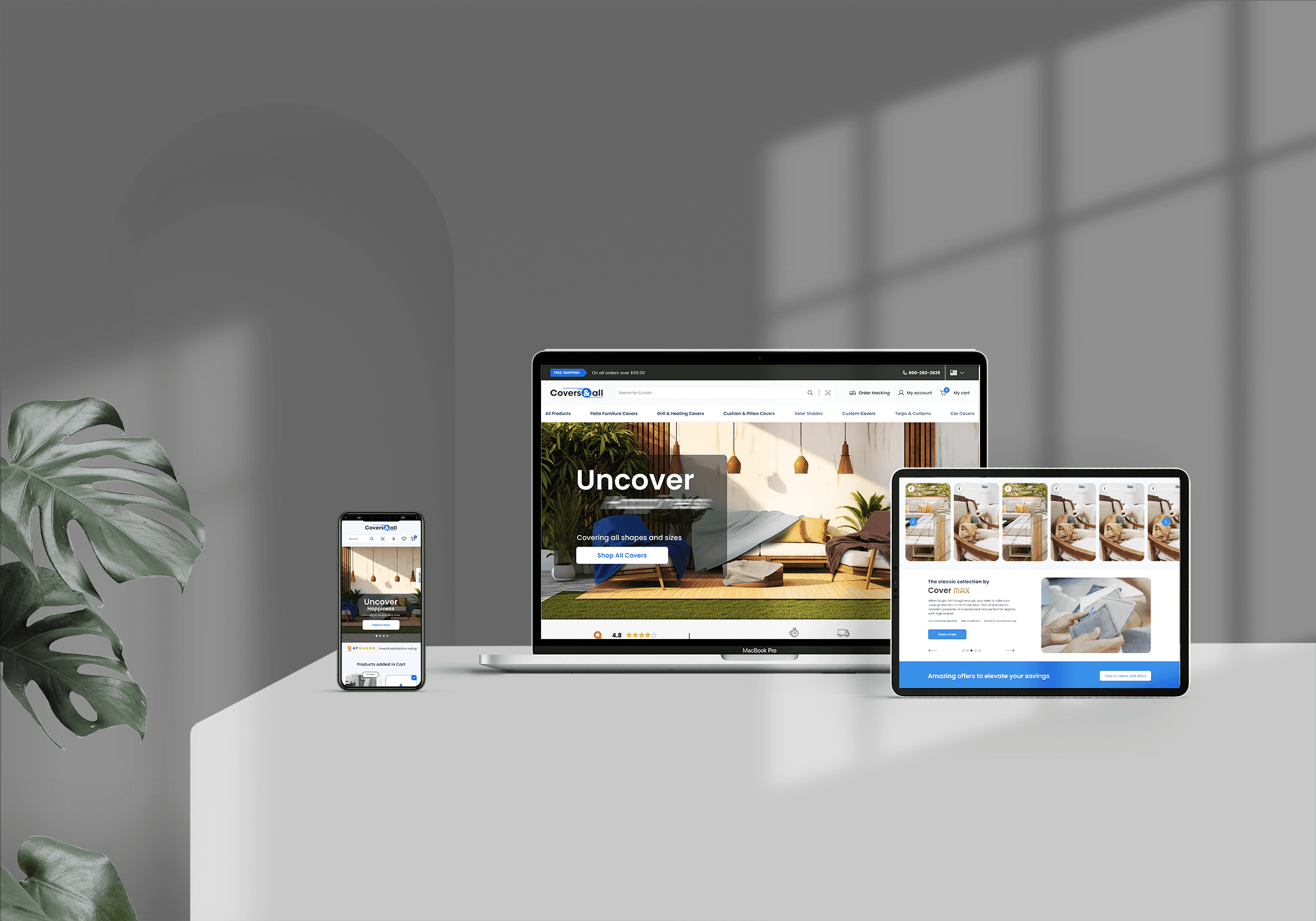
Redesigned the CoversAndAll cart page bulk discount flow to boost conversions and enhance UX for B2B customers by turning a passive discount table into an interactive, value-driven interface.
COVERS&ALL FEATURE
COV- Design system

Branding
Created a comprehensive design system for Covers&All to ensure consistency across the platform, including typography, color palette, components, and UI patterns for a scalable and cohesive user experience.
More Projects
Branding
DRONEC WEBSITE DESIGN
DRONEC is an e-commerce website designed for purchasing drones. The platform allows users to easily explore different drone models, understand their features, and make quick purchases with a smooth browsing experience.
UX / UI Design
Redesigned the CoversAndAll cart page bulk discount flow to boost conversions and enhance UX for B2B customers by turning a passive discount table into an interactive, value-driven interface.
COVERS&ALL FEATURE
Branding
Created a comprehensive design system for Covers&All to ensure consistency across the platform, including typography, color palette, components, and UI patterns for a scalable and cohesive user experience.
COV- Design system
Branding
DRONEC WEBSITE DESIGN
DRONEC is an e-commerce website designed for purchasing drones. The platform allows users to easily explore different drone models, understand their features, and make quick purchases with a smooth browsing experience.
UX / UI Design
COVERS&ALL FEATURE
Redesigned the CoversAndAll cart page bulk discount flow to boost conversions and enhance UX for B2B customers by turning a passive discount table into an interactive, value-driven interface.
Branding
COV- Design system
Created a comprehensive design system for Covers&All to ensure consistency across the platform, including typography, color palette, components, and UI patterns for a scalable and cohesive user experience.
More Projects
PatioHQ – PDP Page Redesign Case Study
PatioHQ – PDP Page Redesign Case Study
PatioHQ – PDP Page Redesign Case Study
01 — Project Overview
The goal of this project was to redesign the PatioHQ Product Detail Page (PDP) to improve product clarity, simplify customization, and increase conversions. The existing PDP had structural issues such as inconsistent spacing, lack of visual hierarchy, unclear measurement selection, and weak CTA visibility. Through UX auditing and competitor benchmarking, I developed a modern, clean, and user-friendly PDP for both mobile and desktop.
01 — Project Overview
The goal of this project was to redesign the PatioHQ Product Detail Page (PDP) to improve product clarity, simplify customization, and increase conversions. The existing PDP had structural issues such as inconsistent spacing, lack of visual hierarchy, unclear measurement selection, and weak CTA visibility. Through UX auditing and competitor benchmarking, I developed a modern, clean, and user-friendly PDP for both mobile and desktop.
01 — Project Overview
The goal of this project was to redesign the PatioHQ Product Detail Page (PDP) to improve product clarity, simplify customization, and increase conversions. The existing PDP had structural issues such as inconsistent spacing, lack of visual hierarchy, unclear measurement selection, and weak CTA visibility. Through UX auditing and competitor benchmarking, I developed a modern, clean, and user-friendly PDP for both mobile and desktop.
02 — My Role & responsiblity
02 — My Role & responsiblity
02 — My Role & responsiblity
I was responsible for evaluating the current product experience, identifying usability issues, benchmarking leading brands, creating design directions, and delivering the final high-fidelity redesign.
I was responsible for evaluating the current product experience, identifying usability issues, benchmarking leading brands, creating design directions, and delivering the final high-fidelity redesign.
Conducted detailed UX Audit of existing PDP
Identified usability gaps, spacing inconsistencies, and visual hierarchy issues
Performed competitor analysis across 12+ global furniture brands
Created redesign strategy based on insights
Designed mobile and desktop PDP layouts
Organized entire customization flow (measurements, materials, styles, features)
Enhanced CTA visibility and trust components
Delivered clean UI with consistent grid, spacing, and color system
Collaborated with team for feedback iterations
03 — Timeline Overview
03 — Timeline Overview
03 — Timeline Overview
Total Duration: 2-3 Weeks
Week 1: UX Audit + Documentation
Week 1–2: Competitor research & benchmarking
Week 2: Wireframes (Mobile + Desktop)
Week 3: Final UI Design
Week 3: Review, iteration & delivery
Total Duration: 2-3 Weeks
Week 1: UX Audit + Documentation
Week 1–2: Competitor research & benchmarking
Week 2: Wireframes (Mobile + Desktop)
Week 3: Final UI Design
Week 3: Review, iteration & delivery
04 — Design Process
04 — Design Process
04 — Design Process
1. UX Audit
Typography not structured
Inconsistent 8px spacing
CTAs not visible
Product images lacked clarity
Sections not aligned
Review & delivery info placed too low
1. UX Audit
Typography not structured
Inconsistent 8px spacing
CTAs not visible
Product images lacked clarity
Sections not aligned
Review & delivery info placed too low
2. Research & Competitor Analysis
Benchmarked brands like:
Frontgate, Polywood, Sabai, Urban Ladder, Manutti, Pepperfry, etc.
Key learnings:
Large hero image
Guided customization
Trust badges
Clear pricing
Sticky Add to Cart
Reviews above the fold
2. Research & Competitor Analysis
Benchmarked brands like:
Frontgate, Polywood, Sabai, Urban Ladder, Manutti, Pepperfry, etc.
Key learnings:
Large hero image
Guided customization
Trust badges
Clear pricing
Sticky Add to Cart
Reviews above the fold
2. Research & Competitor Analysis
Benchmarked brands like:
Frontgate, Polywood, Sabai, Urban Ladder, Manutti, Pepperfry, etc.
Key learnings:
Large hero image
Guided customization
Trust badges
Clear pricing
Sticky Add to Cart
Reviews above the fold
3. Information Architecture
Re-grouped sections logically
Created modular card-based structure
Introduced unified color, typography, spacing system
3. Information Architecture
Re-grouped sections logically
Created modular card-based structure
Introduced unified color, typography, spacing system
4. Wireframes
Re-grouped sections logically
Organized mobile scroll
Clean layout for customization flow
Clear labels + cards + grids layouts
4. Wireframes
Re-grouped sections logically
Organized mobile scroll
Clean layout for customization flow
Clear labels + cards + grids layouts
5. Final UI Design
Strong hierarchy
Consistent spacing (8px grid)
Modern color palette
Sticky CTA
Cleanest mobile flow with minimal clutter
5. Final UI Design
Strong hierarchy
Consistent spacing (8px grid)
Modern color palette
Sticky CTA
Cleanest mobile flow with minimal clutter
Conducted detailed UX Audit of existing PDP
Identified usability gaps, spacing inconsistencies, and visual hierarchy issues
Performed competitor analysis across 12+ global furniture brands
Created redesign strategy based on insights
Designed mobile and desktop PDP layouts
Organized entire customization flow (measurements, materials, styles, features)
Enhanced CTA visibility and trust components
Delivered clean UI with consistent grid, spacing, and color system
Collaborated with team for feedback iterations
05 — Challenges & Solutions
05 — Challenges & Solutions
05 — Challenges & Solutions
Challenge 1: Cluttered Information Flow
Solution: Structured content into logical modules (Measurements → Material → Back Style → Features).
Challenge 1: Cluttered Information Flow
Solution: Structured content into logical modules (Measurements → Material → Back Style → Features).
Challenge 2: Product images were too small
Solution: Introduced large hero image + zoom + clear thumbnails.
Challenge 2: Product images were too small
Solution: Introduced large hero image + zoom + clear thumbnails.
Challenge 3: Low CTA visibility
Solution: Added sticky Add-to-Cart button and placed reviews + delivery info above the fold.
Challenge 3: Low CTA visibility
Solution: Added sticky Add-to-Cart button and placed reviews + delivery info above the fold.
Challenge 4: No visual hierarchy
Solution: Built a consistent typography and spacing system.
Challenge 4: No visual hierarchy
Solution: Built a consistent typography and spacing system.
Challenge 5: Confusing customization options
Solution: Replaced dropdowns with card-based selection patterns.
Challenge 5: Confusing customization options
Solution: Replaced dropdowns with card-based selection patterns.
Expected outcomes after redesign:
Better user understanding of product features
Reduced confusion in size & material selection
Improved Add to Cart conversions
Increased trust through improved reviews, delivery, and USP placement
Cleaner mobile experience → higher engagement
Stronger brand perception with consistent design system
Expected outcomes after redesign:
Better user understanding of product features
Reduced confusion in size & material selection
Improved Add to Cart conversions
Increased trust through improved reviews, delivery, and USP placement
Cleaner mobile experience → higher engagement
Stronger brand perception with consistent design system
06 — Impact
06 — Impact
06 — Impact
07 — Tools Used
07 — Tools Used
07 — Tools Used
Notion (UX Audit, Documentation, Planning)
Photoshop (Image Cleaning & Enhancements)
Figma (UI Design, Prototyping)
Jira (Task Management, Sprint Tracking & Workflow Management)
Notion (UX Audit, Documentation, Planning)
Photoshop (Image Cleaning & Enhancements)
Figma (UI Design, Prototyping)
Jira (Task Management, Sprint Tracking & Workflow Management)
Notion (UX Audit, Documentation, Planning)
Photoshop (Image Cleaning & Enhancements)
Figma (UI Design, Prototyping)
Jira (Task Management, Sprint Tracking & Workflow Management)
08 — Reflection
08 — Reflection
08 — Reflection
This project taught me the importance of:
Small details like spacing & hierarchy can completely change user perception
Mobile-first thinking leads to stronger overall design
Competitor analysis provides strong direction when used strategically
Clear structure and grouping reduces cognitive load for users
A consistent design system always improves usability
The PatioHQ PDP redesign improved clarity, structure, and trust — creating a premium, user-friendly shopping experience.
This project taught me the importance of:
Small details like spacing & hierarchy can completely change user perception
Mobile-first thinking leads to stronger overall design
Competitor analysis provides strong direction when used strategically
Clear structure and grouping reduces cognitive load for users
A consistent design system always improves usability
The PatioHQ PDP redesign improved clarity, structure, and trust — creating a premium, user-friendly shopping experience.
Final User Inerface
Final User Inerface
More Projects
Branding
DRONEC WEBSITE DESIGN
DRONEC is an e-commerce website designed for purchasing drones. The platform allows users to easily explore different drone models, understand their features, and make quick purchases with a smooth browsing experience.
UX / UI Design
Redesigned the CoversAndAll cart page bulk discount flow to boost conversions and enhance UX for B2B customers by turning a passive discount table into an interactive, value-driven interface.
COVERS&ALL FEATURE
COV- Design system
Branding
Created a comprehensive design system for Covers&All to ensure consistency across the platform, including typography, color palette, components, and UI patterns for a scalable and cohesive user experience.
More Projects
Branding
DRONEC WEBSITE DESIGN
DRONEC is an e-commerce website designed for purchasing drones. The platform allows users to easily explore different drone models, understand their features, and make quick purchases with a smooth browsing experience.
UX / UI Design
Redesigned the CoversAndAll cart page bulk discount flow to boost conversions and enhance UX for B2B customers by turning a passive discount table into an interactive, value-driven interface.
COVERS&ALL FEATURE
Branding
Created a comprehensive design system for Covers&All to ensure consistency across the platform, including typography, color palette, components, and UI patterns for a scalable and cohesive user experience.
COV- Design system
Branding
DRONEC WEBSITE DESIGN
DRONEC is an e-commerce website designed for purchasing drones. The platform allows users to easily explore different drone models, understand their features, and make quick purchases with a smooth browsing experience.
UX / UI Design
COVERS&ALL FEATURE
Redesigned the CoversAndAll cart page bulk discount flow to boost conversions and enhance UX for B2B customers by turning a passive discount table into an interactive, value-driven interface.
Branding
COV- Design system
Created a comprehensive design system for Covers&All to ensure consistency across the platform, including typography, color palette, components, and UI patterns for a scalable and cohesive user experience.
More Projects
PatioHQ – PDP Page Redesign Case Study
PatioHQ – PDP Page Redesign Case Study
PatioHQ – PDP Page Redesign Case Study
01 — Project Overview
The goal of this project was to redesign the PatioHQ Product Detail Page (PDP) to improve product clarity, simplify customization, and increase conversions. The existing PDP had structural issues such as inconsistent spacing, lack of visual hierarchy, unclear measurement selection, and weak CTA visibility. Through UX auditing and competitor benchmarking, I developed a modern, clean, and user-friendly PDP for both mobile and desktop.
01 — Project Overview
The goal of this project was to redesign the PatioHQ Product Detail Page (PDP) to improve product clarity, simplify customization, and increase conversions. The existing PDP had structural issues such as inconsistent spacing, lack of visual hierarchy, unclear measurement selection, and weak CTA visibility. Through UX auditing and competitor benchmarking, I developed a modern, clean, and user-friendly PDP for both mobile and desktop.
01 — Project Overview
The goal of this project was to redesign the PatioHQ Product Detail Page (PDP) to improve product clarity, simplify customization, and increase conversions. The existing PDP had structural issues such as inconsistent spacing, lack of visual hierarchy, unclear measurement selection, and weak CTA visibility. Through UX auditing and competitor benchmarking, I developed a modern, clean, and user-friendly PDP for both mobile and desktop.
02 — My Role & responsiblity
02 — My Role & responsiblity
02 — My Role & responsiblity
I was responsible for evaluating the current product experience, identifying usability issues, benchmarking leading brands, creating design directions, and delivering the final high-fidelity redesign.
I was responsible for evaluating the current product experience, identifying usability issues, benchmarking leading brands, creating design directions, and delivering the final high-fidelity redesign.
Conducted detailed UX Audit of existing PDP
Identified usability gaps, spacing inconsistencies, and visual hierarchy issues
Performed competitor analysis across 12+ global furniture brands
Created redesign strategy based on insights
Designed mobile and desktop PDP layouts
Organized entire customization flow (measurements, materials, styles, features)
Enhanced CTA visibility and trust components
Delivered clean UI with consistent grid, spacing, and color system
Collaborated with team for feedback iterations
03 — Timeline Overview
03 — Timeline Overview
03 — Timeline Overview
Total Duration: 2-3 Weeks
Week 1: UX Audit + Documentation
Week 1–2: Competitor research & benchmarking
Week 2: Wireframes (Mobile + Desktop)
Week 3: Final UI Design
Week 3: Review, iteration & delivery
Total Duration: 2-3 Weeks
Week 1: UX Audit + Documentation
Week 1–2: Competitor research & benchmarking
Week 2: Wireframes (Mobile + Desktop)
Week 3: Final UI Design
Week 3: Review, iteration & delivery
04 — Design Process
04 — Design Process
04 — Design Process
1. UX Audit
Typography not structured
Inconsistent 8px spacing
CTAs not visible
Product images lacked clarity
Sections not aligned
Review & delivery info placed too low
1. UX Audit
Typography not structured
Inconsistent 8px spacing
CTAs not visible
Product images lacked clarity
Sections not aligned
Review & delivery info placed too low
2. Research & Competitor Analysis
Benchmarked brands like:
Frontgate, Polywood, Sabai, Urban Ladder, Manutti, Pepperfry, etc.
Key learnings:
Large hero image
Guided customization
Trust badges
Clear pricing
Sticky Add to Cart
Reviews above the fold
2. Research & Competitor Analysis
Benchmarked brands like:
Frontgate, Polywood, Sabai, Urban Ladder, Manutti, Pepperfry, etc.
Key learnings:
Large hero image
Guided customization
Trust badges
Clear pricing
Sticky Add to Cart
Reviews above the fold
2. Research & Competitor Analysis
Benchmarked brands like:
Frontgate, Polywood, Sabai, Urban Ladder, Manutti, Pepperfry, etc.
Key learnings:
Large hero image
Guided customization
Trust badges
Clear pricing
Sticky Add to Cart
Reviews above the fold
3. Information Architecture
Re-grouped sections logically
Created modular card-based structure
Introduced unified color, typography, spacing system
3. Information Architecture
Re-grouped sections logically
Created modular card-based structure
Introduced unified color, typography, spacing system
4. Wireframes
Re-grouped sections logically
Organized mobile scroll
Clean layout for customization flow
Clear labels + cards + grids layouts
4. Wireframes
Re-grouped sections logically
Organized mobile scroll
Clean layout for customization flow
Clear labels + cards + grids layouts
5. Final UI Design
Strong hierarchy
Consistent spacing (8px grid)
Modern color palette
Sticky CTA
Cleanest mobile flow with minimal clutter
5. Final UI Design
Strong hierarchy
Consistent spacing (8px grid)
Modern color palette
Sticky CTA
Cleanest mobile flow with minimal clutter
Conducted detailed UX Audit of existing PDP
Identified usability gaps, spacing inconsistencies, and visual hierarchy issues
Performed competitor analysis across 12+ global furniture brands
Created redesign strategy based on insights
Designed mobile and desktop PDP layouts
Organized entire customization flow (measurements, materials, styles, features)
Enhanced CTA visibility and trust components
Delivered clean UI with consistent grid, spacing, and color system
Collaborated with team for feedback iterations
05 — Challenges & Solutions
05 — Challenges & Solutions
05 — Challenges & Solutions
Challenge 1: Cluttered Information Flow
Solution: Structured content into logical modules (Measurements → Material → Back Style → Features).
Challenge 1: Cluttered Information Flow
Solution: Structured content into logical modules (Measurements → Material → Back Style → Features).
Challenge 2: Product images were too small
Solution: Introduced large hero image + zoom + clear thumbnails.
Challenge 2: Product images were too small
Solution: Introduced large hero image + zoom + clear thumbnails.
Challenge 3: Low CTA visibility
Solution: Added sticky Add-to-Cart button and placed reviews + delivery info above the fold.
Challenge 3: Low CTA visibility
Solution: Added sticky Add-to-Cart button and placed reviews + delivery info above the fold.
Challenge 4: No visual hierarchy
Solution: Built a consistent typography and spacing system.
Challenge 4: No visual hierarchy
Solution: Built a consistent typography and spacing system.
Challenge 5: Confusing customization options
Solution: Replaced dropdowns with card-based selection patterns.
Challenge 5: Confusing customization options
Solution: Replaced dropdowns with card-based selection patterns.
Expected outcomes after redesign:
Better user understanding of product features
Reduced confusion in size & material selection
Improved Add to Cart conversions
Increased trust through improved reviews, delivery, and USP placement
Cleaner mobile experience → higher engagement
Stronger brand perception with consistent design system
Expected outcomes after redesign:
Better user understanding of product features
Reduced confusion in size & material selection
Improved Add to Cart conversions
Increased trust through improved reviews, delivery, and USP placement
Cleaner mobile experience → higher engagement
Stronger brand perception with consistent design system
06 — Impact
06 — Impact
06 — Impact
07 — Tools Used
07 — Tools Used
07 — Tools Used
Notion (UX Audit, Documentation, Planning)
Photoshop (Image Cleaning & Enhancements)
Figma (UI Design, Prototyping)
Jira (Task Management, Sprint Tracking & Workflow Management)
Notion (UX Audit, Documentation, Planning)
Photoshop (Image Cleaning & Enhancements)
Figma (UI Design, Prototyping)
Jira (Task Management, Sprint Tracking & Workflow Management)
Notion (UX Audit, Documentation, Planning)
Photoshop (Image Cleaning & Enhancements)
Figma (UI Design, Prototyping)
Jira (Task Management, Sprint Tracking & Workflow Management)
08 — Reflection
08 — Reflection
08 — Reflection
This project taught me the importance of:
Small details like spacing & hierarchy can completely change user perception
Mobile-first thinking leads to stronger overall design
Competitor analysis provides strong direction when used strategically
Clear structure and grouping reduces cognitive load for users
A consistent design system always improves usability
The PatioHQ PDP redesign improved clarity, structure, and trust — creating a premium, user-friendly shopping experience.
This project taught me the importance of:
Small details like spacing & hierarchy can completely change user perception
Mobile-first thinking leads to stronger overall design
Competitor analysis provides strong direction when used strategically
Clear structure and grouping reduces cognitive load for users
A consistent design system always improves usability
The PatioHQ PDP redesign improved clarity, structure, and trust — creating a premium, user-friendly shopping experience.
Final User Inerface
Final User Inerface
More Projects
Branding
DRONEC WEBSITE DESIGN
DRONEC is an e-commerce website designed for purchasing drones. The platform allows users to easily explore different drone models, understand their features, and make quick purchases with a smooth browsing experience.
UX / UI Design
Redesigned the CoversAndAll cart page bulk discount flow to boost conversions and enhance UX for B2B customers by turning a passive discount table into an interactive, value-driven interface.
COVERS&ALL FEATURE
COV- Design system
Branding
Created a comprehensive design system for Covers&All to ensure consistency across the platform, including typography, color palette, components, and UI patterns for a scalable and cohesive user experience.
More Projects
Branding
DRONEC WEBSITE DESIGN
DRONEC is an e-commerce website designed for purchasing drones. The platform allows users to easily explore different drone models, understand their features, and make quick purchases with a smooth browsing experience.
UX / UI Design
Redesigned the CoversAndAll cart page bulk discount flow to boost conversions and enhance UX for B2B customers by turning a passive discount table into an interactive, value-driven interface.
COVERS&ALL FEATURE
Branding
Created a comprehensive design system for Covers&All to ensure consistency across the platform, including typography, color palette, components, and UI patterns for a scalable and cohesive user experience.
COV- Design system
Branding
DRONEC WEBSITE DESIGN
DRONEC is an e-commerce website designed for purchasing drones. The platform allows users to easily explore different drone models, understand their features, and make quick purchases with a smooth browsing experience.
UX / UI Design
COVERS&ALL FEATURE
Redesigned the CoversAndAll cart page bulk discount flow to boost conversions and enhance UX for B2B customers by turning a passive discount table into an interactive, value-driven interface.
Branding
COV- Design system
Created a comprehensive design system for Covers&All to ensure consistency across the platform, including typography, color palette, components, and UI patterns for a scalable and cohesive user experience.